This past August we purchased our (hopefully) forever home. After moving from Seattle to Portland 2ish years ago, we decided that it would be long-term and went on the hunt for our dream house. The only problem is that Portland was fast becoming a hot market, similar to Seattle prices were skyrocketing and it made the search super depressing to see how far our money would go in the neighborhoods we were insistent on living in.
We could either stretch our budget big-time for a nice new build, or stay within our budget on a small, old house that was only okay. I was also super nervous about over paying for a home in 2017, only to have the market crash again.
Thankfully we had a WONDERFUL real estate agent, Megan Meagher who went above and beyond to find us our perfect match. Soon enough, we were circling back to a couple homes that I had written off the first time around. One being a large (for us) 40's home with a killer backyard, but in dire need for a facelift.
The house didn't even have a master bathroom.. just one on the main level to share between bedrooms and one downstairs by the guest room. It was also at the top of our budget, but the huge backyard gave me a sense of comfort in our investment..... housing in Portland is limited and people are splitting up yards to build more.. it's nuts. The fact that we'd have so much property right in Portland proper felt like insurance.
Sooooo, we bought it. We decided to tackle the main level projects right away, while leaving other big changes to tackle in a few years. For example... new kitchen NOW.. but we'd live with sharing a bathroom with our 4 year old for a few more years before turning our upstairs loft into a master suite, hopefully creating our absolute dream home someday.
And guess what guys? Our kitchen is finished and I LOVE it. It's way more ... loud? ... trendy?.. than the plans we started with, but now that it's done, I wouldn't change a thing.. it has tons of personality and it makes me feel happy every time I come in for my coffee in the morning.
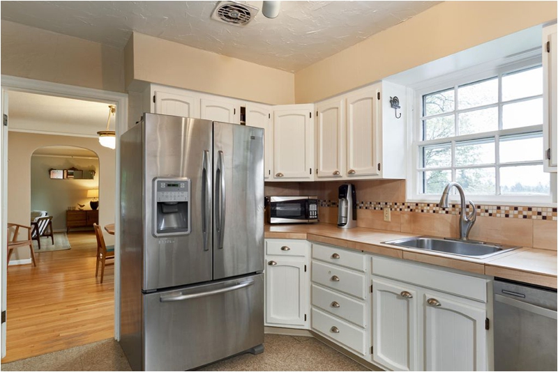
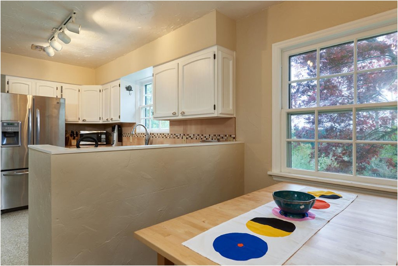
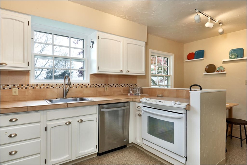
Behold: the old kitchen:
It seemed so cramped to me in there.. I remember really wanting to knock out that peninsula big time.. but when we started planning it out, we realized we'd lose SO much storage that we really couldn't afford to get rid of, so it stayed. BUT we did start fresh and got rid of that back wall on it, which made it feel more open. I know a lot of other people would've knocked down the wall between the kitchen and dining room but I'm someone who loves the look of older homes with lots of rooms, so we opened up the entry a little and let it be.
And the new kitchen!
Against almost all advice, we went with a honed carrera marble instead of a look-alike quartz. In my opinion, there was just no comparison and none of them actually looked like marble to me. It was a decision we went back and forth on but I'm really please with the outcome.
Having it honed gives it more of a laid-back feel as well as makes scratches and etching less noticeable. I should also mention that I am NOT a type A perfectionist.. I don't mind the whole patina aspect of marble.
Every design has to start somewhere and I planned the whole look of our remodel on this cement flooring from Oregon Tile & Marble. I fell in love with it a couple years ago and never looked back. Because the kitchen was a very separate room, it was the perfect opportunity to go crazy. The only issue came when we installed the flooring and it ended up being a warm light gray/black instead of white/black. There's definitely pros to this: it doesn't show dirt as easily, looks a little less stark.. but it didn't match the white cabinet paint we had picked out AT ALL. The bright white between the flooring and the marble just didn't look right.
So I freaked out and enlisted some help from a local interior designer, Caitlin Bowman.. she came over the next day and changed my life by suggesting black lower cabinets.
I used to HATE dual toned cabinets in kitchens.. I couldn't believe I was putting them in my own space! But she's genius and it made all the difference! I couldn't imagine it any other way now.
We decided to hide the microwave behind the peninsula.. I didn't want one up on the counters, but knew that we'd probably miss having one if we gave it up altogether. Underneath the microwave is a little drawer for Baker things.. it's a common theme throughout our house to have little "Baker spots" so that he can get to things on his own without his stuff taking over.
We added built-in benches to create a little dining nook and my MIL is currently working on cushions. I wanted to bring in some warmth so used a natural wood table and then added some open shelving on the other side of the kitchen.
Hi Bella
Our pantry is small, but very efficient..and a little messy.. hey, I told you, I'm not a perfectionist and I'm not going to pretend for photos. :)
One of my favorite additions has been this spice rack.. it's just so handy! I'm just now noticing the one tipped over in my photo.. whoops. :)
A couple of my other favorite details:
The satin brass pulls and knobs from our friends at School House Electric, the pendant light over the nook and little one over the window.. soft closing cabinets!!
You guys. I told Lucas I didn't care about having that feature and we should save money there.. thankfully he disagreed and it brings my joy every time!
And lastly, we did a panel dishwasher to match the lower cabinets and I'm in love with it. Since it's a smaller space, it's nice not to have the added stainless breaking up the black.. and I love the bigger brass pull <3
I also love the faucet we picked out from Californa Faucets. I was crazy particular about the brass of the faucet matching the pulls of the cabinets perfectly. A lot that we looked at were more of a dark, almost greenish brass, which was driving me nuts. So it's somewhere we decided to splurge a little. I absolutely love that the button to switch to spray isn't a cheesy black plastic piece but instead, a brass button.. It's the little things right???
The one detail I think we personally wasted money on was under cabinet lighting.. it made complete sense to put it in originally, but once we added a dimmer and the light above the sink, it just wasn't necessary. Lesson learned.
I think the other thing that really made a difference for me was re-configuring where appliances were.. the layout we have now just feels more open and user friendly to me. So far, I've been really pleased!
Well, there you have it.. after being without a working kitchen for months, everything feels worth it and we're slowly on our way to making this new house our dream home. Thanks for stopping by! Next up: bathroom.
Questions? Comments? Feelings? Let me know! Design is fast becoming one of my favorite things to talk about, following only the topics of Baker and sleep. I mean, I can talk a lot about sleep.
Contractor: Ivory Hammer Renovations
Custom Cabinets: Priest Cabinets
Hardware: School House Electric
Flooring: Oregon Tile & Marble


